OVERVIEW
The UX behind this portfolio
Problem to solve
How do we apply the same principles of UX to our own portfolio websites?
Role
UX/UI Designer - Full process
Client
Self-project
Year
2020

Just like any website, a portfolio site also has a goal, a strategy, and a target audience. We do a lot of competitive research to get inspiration from other portfolios and follow deemed best practices on including resumes or organizing project pages. Throughout the process of putting together this portfolio it helped to sketch out and organize it, in the same way, I would do any other website design project.
THE PROCESS
Understanding the personas
Understanding the people behind the business and their goals
Especially as a service-based company, it was important to identify what the team was offering and whom they aspired to attract.
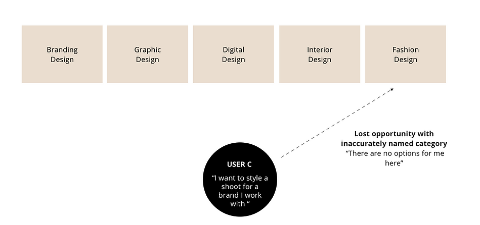
Their original lists of services:
Branding Design
Graphic Design
Digital Design
Interior Design
Fashion Design
Their goals and target audience when asked were:
They wanted to attract people who related to them. People who chose to pursue their dreams and working together with them could make ideas comes to life.
Overall Feedback:
What is lacking is a clear journey for visitors. The site reads more like a portfolio of skill sets with technical names and explanations instead of a flow a potential client could navigate with ease.
Strategy
Using our target audience's needs and pain points to influence the information architecture.

Ideate and design

Pulling from pain points of the user persona needing clear information with their busy schedules, it made sense to explore buckets/categorizations of available services to ease this.
Key elements:
1. Reduce the cognitive load of searching through a larger list of available options and motivate users to reach an actionable item that fits their needs.
2. Rename the current categories to match industry standards for what people are expecting to find and search for. (Also a plus for SEO)
3. Change the organizational approach from what a business offers to what people are looking for!


New site map
Separated into 3 main categories with subcategories fitting the companies skill set but based on industry naming conventions.
For the Business
For the Home
For You
This allows users to explore different categories but still find what they ultimately need and follow through with the actionable items that will result in leads for ANDELLE.

Wireframe
Provided a sample Home Page based on their initial design that reflects communicating the 3 categories from the beginning of a potential client's journey on their site.

Outcomes
The team at ANDELLE were happy with the new site map and approach to their website! They expressed their understanding of the value of UX. Overall, the changes delayed their initial launch date but they said:
"It's so much more organized and specific. Thanks to you!"
- Michelle Vazquez, Co-Founder of ANDELLE Creative